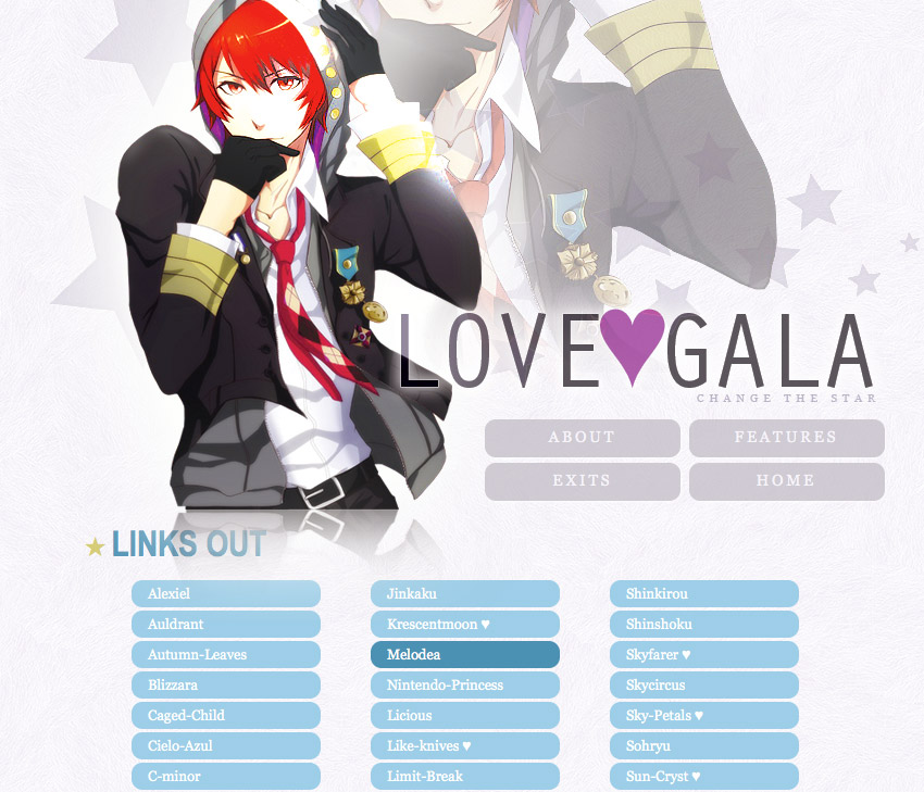
Does anyone want to give me some feedback what I have going so far for Love-gala.org? http://love-gala.org/index2.php
I'm looking for suggestions on what to do with some of the content pages. (I have a bunch of typos I need to go in and fix) I like what I have for most of the pages but the "Features" page needs to be worked out. I am also unsure if I like the wall of link buttons on exits.php. :\ I think I want to spend more time making that look better. And past.php is lacking. I might add a description for past layouts. Not sure yet. I also want it to open in a popup window or something.
What are you working on right now?
Re: What are you working on right now?
@Destinie
I'm liking the layout so far! It looks very clean ^_^. Also love the affiliates pages (yay, I got Inuyasha!)
Two small things I noticed:
1. On the bottom arrow links, the arrows are not aligned on my browser (Firefox for Mac).
2. On the links out page, the links look very similar to the top links, I changed a couple of things in the CSS to make them look a little different. Here if how it came out: Links Out Page
If you like it, this are the things I added:
Code: Select all
#content .linkcol ul li {
    background-color: #9ECFE6;
    padding: 5px 5px 5px 15px;
}
#content .linkcol ul li:hover {
    background-color: #4E92B1;
}
#content .linkcol a, #content .linkcol a:hover {color:white}
Re: What are you working on right now?
Thanks for the feedback, Yuzuki! ♥ I'll definitely have to go through some testing with this layout. I do like what you did with the links (I noticed today that they could use some padding). I was using that gray a lot on buttons and links trying to keep consistent but the blue really makes them pop!! I'll be giving that a try.
Re: What are you working on right now?
@Destinie - I really like the format it looks great! For the past layouts, I'd either add a description of the layouts or I'd make that a link to a place where you just have a layout archive! That way, it would look a bit more neat ! I think if you add some text above the links on the links out page, it would make the colors look better! Or what Yuzuki showed, that looks nice as well! You might also want to add a contact page on your exit with an email at least so people know how to find you! Other than that, everything looks great! I like the simple look for your archive of sites you have, and your affiliates page is very neat! The circular images are cute :3 Great job!
please know that i am yours to keep, my beautiful girl.
Re: What are you working on right now?
@Megan Thanks! Also, good point about the contact page! I will definitely add one. A web form might be good, so I'll need to find a nice one~
-
dubiousdisc
- Administrator
- Posts: 2535
- Joined: Thu Jun 21, 2012 5:49 pm
- Contact:
Re: What are you working on right now?
YAAAAY A NEW LAYOUT FOR LOVE-GALA
YAAAAAAAAAAAAAAAAAAAAAAAAAAAAY
Personally I like the buttons wall. I like the hover effect on the buttons, and I think you should use it more through the site since it goes so well with the shiny floor effect of the top image. I'm not sure about the features page. Do you think you could have three buttons for each row?
Also, since you only have one past layout, unless you put previous collective layouts there I don't see much need for a past layouts page, and you could remerge it in the about if you wanted. After all, it's not a giant page. If you really want to have the past layouts page, you could have a much larger thumbnail (thinking 500, 600px) with description underneath, if you want the description.
Hehe, I was about to mention the padding-left on the buttons too. Yuzuki, you beat me! Speaking of fine-tuning, the main menu could have a line-height of 2.5 instead of 2.4 since the text is a tiny bit too high.
Hmm, now I'm looking at Yuzuki's blue edit and yeah, that's also cool! Those buttons could even be purple, since the heart is purple. Or the heart could be blue, if you go Yuzuki's route. Hmm!
Re: What are you working on right now?
The more I look, the more I think I will make the buttons blue. I want them to stand out more on the page, since that's the reason you (someone) would go to that page, anyway. I'll make that change. Also, good suggestion on the past layouts! I am wondering I may even omit it... I added the contact link on that page there so it wouldn't look too odd if I took the link away.
I updated the Features page: http://love-gala.org/features.php :D
I updated the Features page: http://love-gala.org/features.php :D
-
dubiousdisc
- Administrator
- Posts: 2535
- Joined: Thu Jun 21, 2012 5:49 pm
- Contact:
Re: What are you working on right now?
Aw yeah! Yes, I like the effect. Though, I am starting to wonder if there's something wrong with how I'm viewing it. Are the buttons supposed to be very far apart?
Re: What are you working on right now?
Not very. I want to adjust the line-height and alignment of the text, I think that might help with some horizontal spacing issues too.
Re: What are you working on right now?
Destinie: The features page looks great. :)
I've been working on a Saito layout for Fantasy Bit that I just put up.
I've been working on a Saito layout for Fantasy Bit that I just put up.
