Hell, it's okay, I couldn't have a console up until adult age because my parents were opposed to me having a device for the sole purpose of playing!...but naturally I found my away around that. Ahem.
Mikari: I GET IT NOW: ITS WINGS ARE MADE OF FIRE BECAUSE IT'S THE SAME FIRE THAT'S MOVING AFTER BURNING THE REST OF ITS FEATHERS
Pokémon (General)
-
dubiousdisc
- Administrator
- Posts: 2535
- Joined: Thu Jun 21, 2012 5:49 pm
- Contact:
Re: Pokémon (General)
Playing is fun and fun is what life's all about, that's what makes it worth it! :D
aw poor Moltres D:
aw poor Moltres D:

Re: Pokémon (General)
Here's kind of what I mean:
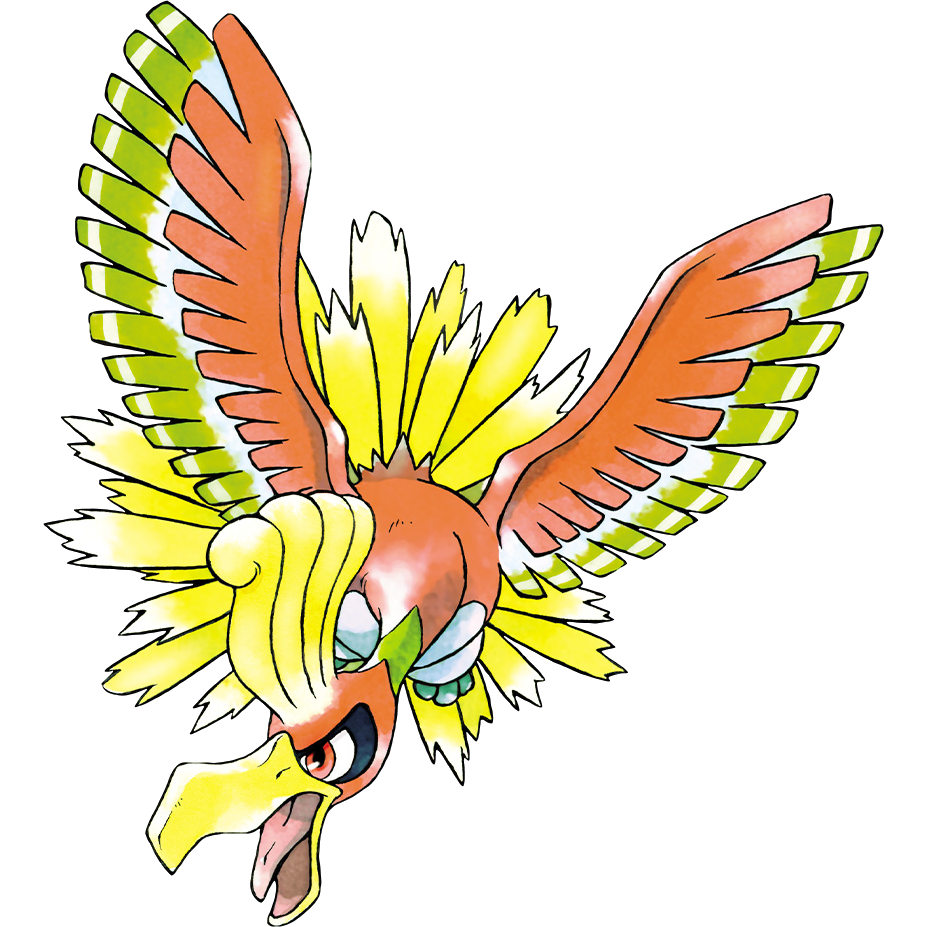 Doesn't it look angrier and more angular?
 This one looks happier.
I dunno, I think that the digital coloring just makes them all look smooth and happy to me.
But then again, the transformation is most easily seen in Pikachu's design:
RECENT ORIGINAL
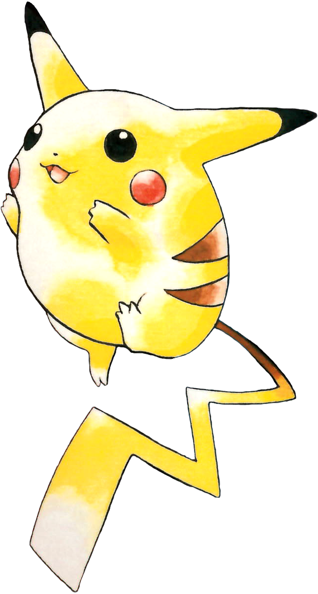
See how its shape changed entirely? It's evolved into a different kind of Pikachu o_o
Doesn't it look angrier and more angular?
This one looks happier. I dunno, I think that the digital coloring just makes them all look smooth and happy to me.
But then again, the transformation is most easily seen in Pikachu's design:
RECENT
ORIGINAL See how its shape changed entirely? It's evolved into a different kind of Pikachu o_o
Re: Pokémon (General)
Maaayyybee it's just me, but I always prefer chubby Pikachu then weight-lost Pikachu, both in the games and anime. He's more huggable that way. Plus being thin makes him look too much like a rodent which is... ehh....
-
dubiousdisc
- Administrator
- Posts: 2535
- Joined: Thu Jun 21, 2012 5:49 pm
- Contact:
Re: Pokémon (General)
I can't say I like Pikachu how it is now but I found it cute when it was a fatty...
Though there is also an aspect of Ken Sugimori's illustration having lost its charm since he abandoned traditional media. :( I think a lot of what made his earlier artwork so nice was the strong whites he obtained by working with watercolor and ink, which he couldn't really bring over to digital. Since the switch, everything looks...I don't know, not as interesting?
Case in point, a very simple Pokémon - Porygon2:
 1999. Look at how little it took to make it look 3-dimensional. The actual coloring has really minimal shading - all it has is highlights! Yet it works!
 2009. So from this artwork I get that this Pokémon's surface is mostly opaque, which doesn't really match with all the shiny of the earlier artwork. There is shading, but it's all in the wrong places so that it looks very flat. Almost no highlights. What happened????
I think one aspect of why I can't really like most of the gen 4-5 Pokémon is that their first artwork was with this style instead than with the old one...maybe if they were made to look like that, I would discover some gems...
Of course this is just my humble opinion. I wish I could like this new style as much as the earlier one actually. Perhaps had it always been in the new style I wouldn't have even complained. It was the switch that made me sad because I really, really liked the old style D:
Though there is also an aspect of Ken Sugimori's illustration having lost its charm since he abandoned traditional media. :( I think a lot of what made his earlier artwork so nice was the strong whites he obtained by working with watercolor and ink, which he couldn't really bring over to digital. Since the switch, everything looks...I don't know, not as interesting?
Case in point, a very simple Pokémon - Porygon2:
1999. Look at how little it took to make it look 3-dimensional. The actual coloring has really minimal shading - all it has is highlights! Yet it works!
2009. So from this artwork I get that this Pokémon's surface is mostly opaque, which doesn't really match with all the shiny of the earlier artwork. There is shading, but it's all in the wrong places so that it looks very flat. Almost no highlights. What happened????I think one aspect of why I can't really like most of the gen 4-5 Pokémon is that their first artwork was with this style instead than with the old one...maybe if they were made to look like that, I would discover some gems...
Of course this is just my humble opinion. I wish I could like this new style as much as the earlier one actually. Perhaps had it always been in the new style I wouldn't have even complained. It was the switch that made me sad because I really, really liked the old style D:
Re: Pokémon (General)
I also miss chubby Pikachu.
The watercolor definitely had an added charm and I really liked how angular Pokemon were. Also, the way he used the Wet-on-Wet technique easily added its three-dimensionality. The colors are more vibrant. I feel like the digital colors get washed out and the highlights aren't bold enough to create the same feeling.
I think, In Ho-Oh's case, the way angular parts became smooth took away from its personality in the original design.
Re: Pokémon (General)
For Ho-Oh I think the pose helps, like he's yelling in the earlier one, about to attack and just flying in the later one. Chubby Pikachu is weird, I had forgotten how chubby he used to be, so round. O.o;; I like the new Pikachu best, though they are both cute and squishy. Either way I think Pikachu looks more like a bunny than a mouse. XD
I like the digital Porygon best, the old one doesn't look very smooth in comparison and the new one looks shiny. Sharp, shiny, bright, smooth colors are my thing. Traditional media tends to be a bit "rough" ans somewhat "sketch-like" which I'm not really into.
lol I'm the odd one out. XD my tastes do sometimes seem different from other people. ^^;;
Re: Pokémon (General)
Can I just say that older, chubby Pikachu looks so much more squishable than the newer one? x3
If you're interested in time travel, meet me last Thursday.
Re: Pokémon (General)
Hmm, I'm probably in the minority here, but I like the newer designs. They just appeal a little better to me. Generation 4 designs were kinda hit-or-miss for me, but Generation 5 was a keeper in my book.
My favorite generation would have to be Generation 2 (GSC). I started with Pokemon Blue and got hooked from there. I'd say my favorite Pokemon games are Crystal, Leaf Green, and Black/White. My all-time favorite Pokemon is Jolteon, the best Electric type everrrr. <3
My favorite generation would have to be Generation 2 (GSC). I started with Pokemon Blue and got hooked from there. I'd say my favorite Pokemon games are Crystal, Leaf Green, and Black/White. My all-time favorite Pokemon is Jolteon, the best Electric type everrrr. <3